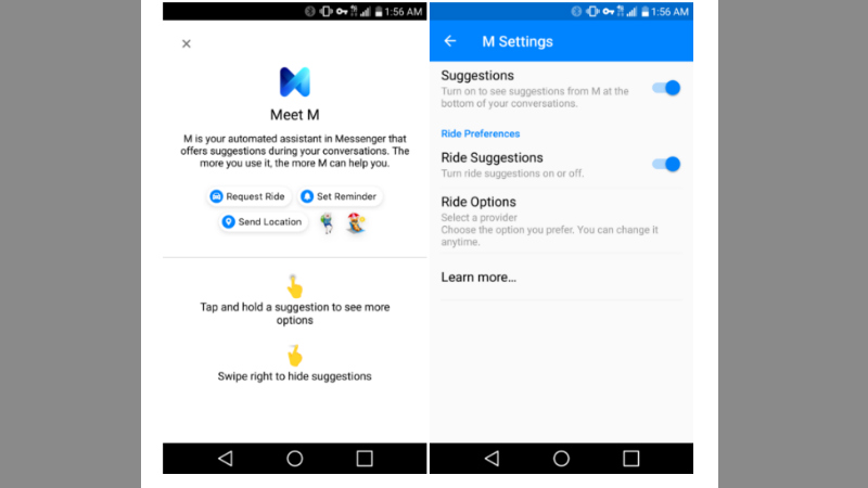
Facebook is introducing two changes to the service this week: one, a revamped interface for the their Android Messenger app and two, a new virtual assistant named “M.” These features were both seen on a beta version of the site, and are expected to be rolled out to the full site sometime soon. Like most Facebook features, it will probably be added slowly once it is rolled out, coming to all users over a period of several weeks.
On the Messenger app front, it looks like Facebook is attempting to declutter things. The new UI will have all chat elements on one row, instead of the two they’re on now. There’s a plus sign to bring us lesser used features like setting a reminder or playing games with another user.
The bar where text is entered is now a small capsule instead of a screen wide space. Overall, things are certainly not as clustered, but it does increase the number of taps needed to get to things like stickers, emojis, and GIFs. Also of note is a new feature that lats you open links externally in a browser instead of the in-app Faceboook option that’s standard now.
The new virtual assistant feature is actually interesting. It was announced back in 2015, but didn’t work quite as planned, and was shelved for a little. It looks like it’s making a slow return now though. “M” won’t be able to do things a real assistant could like purchase tickets or rent a car, but it will give suggestions like stickers in a conversation (randomly, not at all times). Remember the old Office assistant Clippit (no, his name really wasn’t Clippy)? Compare this feature to him.
Of course, this was only the beta release, so there is an excellent chance that the real “M” will have more available features when it’s rolled out to all users.

Be the first to comment on "Facebook Revamping Chat Interface, Testing ‘M’ Virtual Assistant"